
Weibull Distribution in Clinical Medicine: Three Applied Examples
Overview
The Weibull distribution is exceptionally well-suited to clinical and biomedical research because its shape parameter \(k\) carries direct interpretive meaning: whether the hazard of an event is decreasing (\(k < 1\)), constant (\(k = 1\)), or increasing (\(k > 1\)) over time. Below are three worked examples — each with simulated data, model fitting, and publication-style plots.
Example 1: Survival Analysis in Oncology
Background
In a randomised clinical trial for advanced non-small-cell lung cancer (NSCLC), patients are followed until death. We fit a parametric Weibull survival model to estimate median overall survival and extrapolate beyond the trial window — a requirement for health-technology assessment (e.g., NICE submissions in the UK).
A shape parameter \(k > 1\) is expected: the hazard of death rises over time as disease progresses.
Simulate Trial Data
set.seed(2024)
n <- 300

# Treatment arm: better survival (larger scale = longer life)
treat <- data.frame(
  time   = rweibull(n, shape = 1.6, scale = 18),
  status = 1,          # 1 = event (death) observed
  arm    = "Treatment"
)

# Control arm: shorter survival
control <- data.frame(
  time   = rweibull(n, shape = 1.6, scale = 11),
  status = 1,
  arm    = "Control"
)

# Add some random censoring (administrative cut-off at 36 months)
df_onco <- bind_rows(treat, control) |>
  mutate(
    time   = pmin(time, 36),
    status = if_else(time == 36, 0, status)   # 0 = censored
  )

head(df_onco)
## time status arm
## 1 6.120470 1 Treatment
## 2 19.501032 1 Treatment
## 3 9.914616 1 Treatment
## 4 9.493456 1 Treatment
## 5 15.448686 1 Treatment
## 6 9.416640 1 TreatmentFit Weibull Survival Models
# Fit Weibull model per arm using survreg (scale = 1/shape in survreg)
fit_treat   <- survreg(Surv(time, status) ~ 1,
                       data   = filter(df_onco, arm == "Treatment"),
                       dist   = "weibull")

fit_control <- survreg(Surv(time, status) ~ 1,
                       data   = filter(df_onco, arm == "Control"),
                       dist   = "weibull")

# survreg parameterises differently: shape = 1/scale, scale_param = exp(Intercept)
extract_weibull <- function(fit) {
  list(
    shape = 1 / fit$scale,
    scale = exp(coef(fit)[["(Intercept)"]])
  )
}

params_t <- extract_weibull(fit_treat)
params_c <- extract_weibull(fit_control)

cat("Treatment arm  — shape k:", round(params_t$shape, 3),
    "  scale λ:", round(params_t$scale, 3), "\n")
## Treatment arm — shape k: 1.495 scale λ: 19.133cat("Control arm — shape k:", round(params_c$shape, 3),
" scale λ:", round(params_c$scale, 3), "\n")## Control arm — shape k: 1.522 scale λ: 10.051# Median survival = λ * (ln2)^(1/k)
med_t <- params_t$scale * log(2)^(1 / params_t$shape)
med_c <- params_c$scale * log(2)^(1 / params_c$shape)
cat("\nEstimated median OS — Treatment:", round(med_t, 1), "months\n")##
## Estimated median OS — Treatment: 15 monthscat("Estimated median OS — Control: ", round(med_c, 1), "months\n")## Estimated median OS — Control: 7.9 monthsKaplan–Meier vs Weibull Fit
t_seq <- seq(0, 48, length.out = 300)   # extrapolate to 48 months (beyond 36-month trial)

weibull_surv <- bind_rows(
  data.frame(
    t   = t_seq,
    S   = pweibull(t_seq, shape = params_t$shape, scale = params_t$scale, lower.tail = FALSE),
    arm = "Treatment"
  ),
  data.frame(
    t   = t_seq,
    S   = pweibull(t_seq, shape = params_c$shape, scale = params_c$scale, lower.tail = FALSE),
    arm = "Control"
  )
)

# Kaplan–Meier
km_fit <- survfit(Surv(time, status) ~ arm, data = df_onco)
km_df  <- data.frame(
  t      = km_fit$time,
  S      = km_fit$surv,
  arm    = rep(names(km_fit$strata), km_fit$strata)
) |>
  mutate(arm = gsub("arm=", "", arm))

ggplot() +
  geom_step(data = km_df,
            aes(x = t, y = S, color = arm), linewidth = 0.8, alpha = 0.6) +
  geom_line(data = weibull_surv,
            aes(x = t, y = S, color = arm), linewidth = 1.2, linetype = "dashed") +
  geom_vline(xintercept = 36, linetype = "dotted", color = "grey50") +
  annotate("text", x = 36.5, y = 0.85, label = "Trial cut-off\n(36 months)",
           hjust = 0, size = 3.5, color = "grey40") +
  scale_y_continuous(labels = percent, limits = c(0, 1)) +
  scale_color_manual(values = c("Treatment" = "#2A9D8F", "Control" = "#E63946")) +
  labs(
    title    = "Overall Survival: Kaplan–Meier (solid) vs Weibull Fit (dashed)",
    subtitle = "Dashed lines extrapolate beyond the trial window for HTA modelling",
    x        = "Time (months)",
    y        = "Survival Probability",
    color    = "Arm"
  ) +
  theme_minimal(base_size = 13)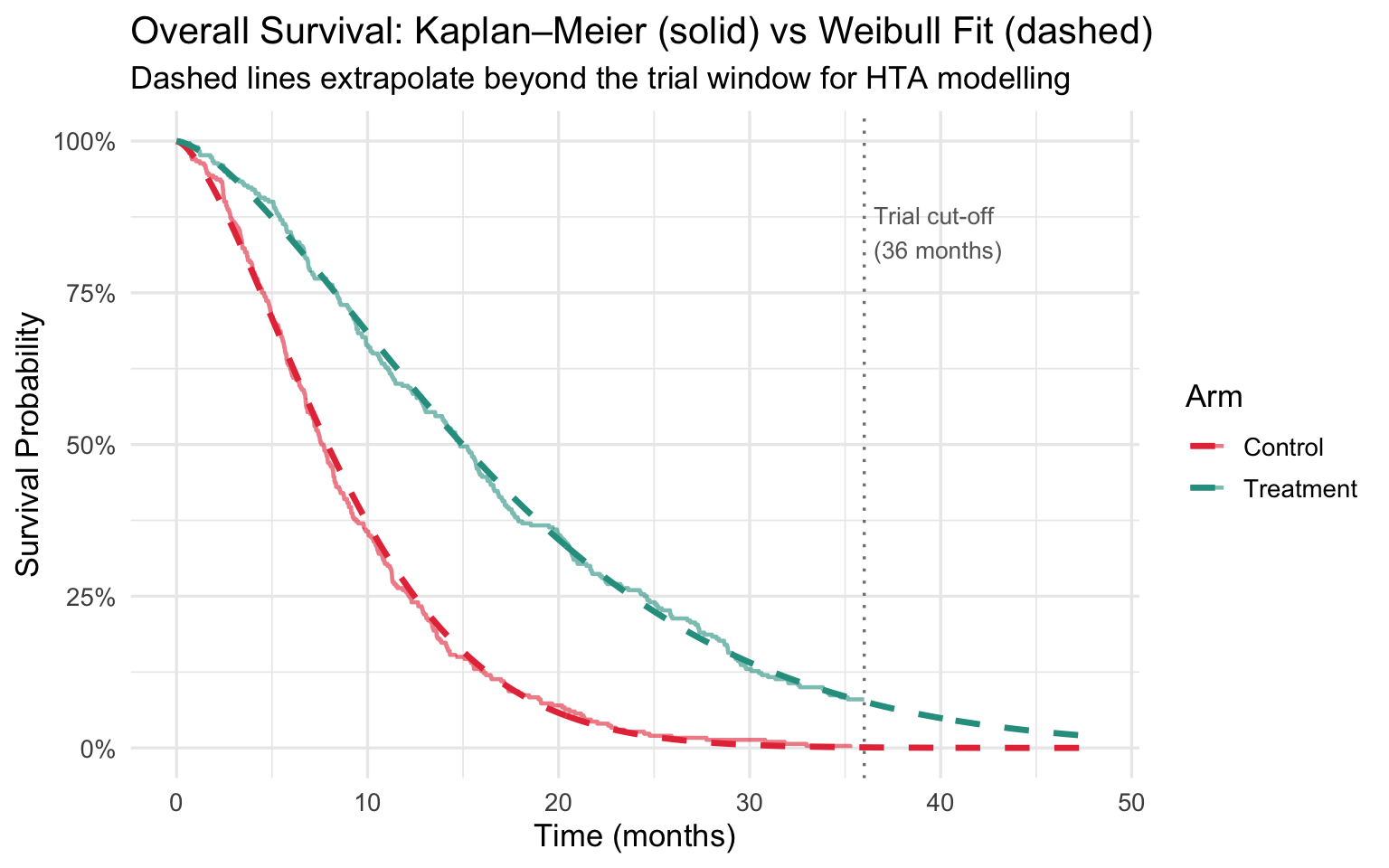
Hazard Over Time
hz_df <- bind_rows(
  data.frame(
    t       = t_seq,
    hazard  = dweibull(t_seq, shape = params_t$shape, scale = params_t$scale) /
              pweibull(t_seq, shape = params_t$shape, scale = params_t$scale, lower.tail = FALSE),
    arm     = "Treatment"
  ),
  data.frame(
    t       = t_seq,
    hazard  = dweibull(t_seq, shape = params_c$shape, scale = params_c$scale) /
              pweibull(t_seq, shape = params_c$shape, scale = params_c$scale, lower.tail = FALSE),
    arm     = "Control"
  )
)

ggplot(hz_df, aes(x = t, y = hazard, color = arm)) +
  geom_line(linewidth = 1.2) +
  scale_color_manual(values = c("Treatment" = "#2A9D8F", "Control" = "#E63946")) +
  labs(
    title   = "Weibull Hazard Function — NSCLC Trial",
    subtitle = paste0("k > 1 in both arms confirms increasing hazard of death over time"),
    x       = "Time (months)",
    y       = "Hazard h(t)",
    color   = "Arm"
  ) +
  theme_minimal(base_size = 13)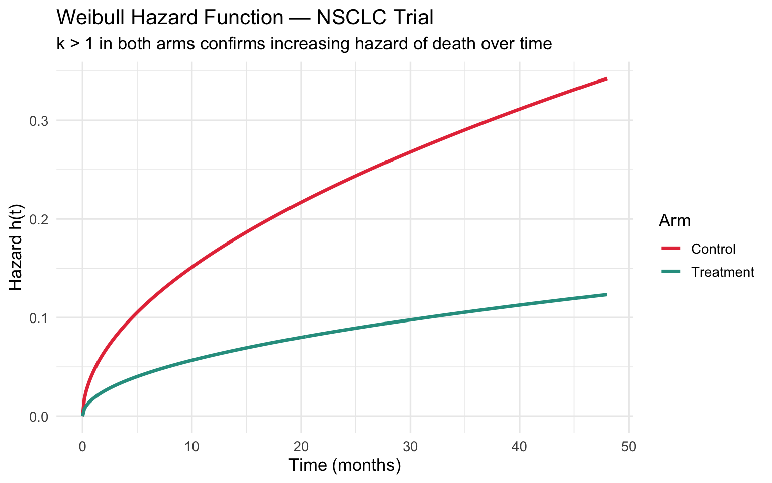
Clinical takeaway: The fitted Weibull (\(k \approx 1.6\)) confirms an increasing hazard of death over time — consistent with progressive disease. The dashed extrapolation beyond 36 months is what HTA bodies use to compute lifetime QALYs and cost-effectiveness.
Example 2: Time to Hospital Readmission (Heart Failure)
Background
Thirty-day readmission for heart failure is a key quality metric penalised under the US Hospital Readmissions Reduction Program (HRRP). Readmission risk is highest in the first few days after discharge, then declines — a decreasing hazard pattern suited to \(k < 1\).
We use a Weibull Accelerated Failure Time (AFT) model to identify patient-level predictors of early readmission.
Simulate Discharge Cohort
set.seed(42)
n <- 500

# Covariates
age          <- round(rnorm(n, mean = 72, sd = 10))
prior_admits <- rpois(n, lambda = 1.5)       # number of admissions in past year
ef_reduced   <- rbinom(n, 1, prob = 0.55)    # 1 = reduced ejection fraction

# Linear predictor (AFT scale): older, more prior admissions, reduced EF = faster readmission
lp <- -0.015 * age - 0.20 * prior_admits - 0.30 * ef_reduced

# Baseline: Weibull with k=0.7 (decreasing hazard), scale=25 days
scale_i <- 25 * exp(lp)   # AFT: covariates multiply the time scale

time_to_readmit <- rweibull(n, shape = 0.7, scale = pmax(scale_i, 1))

# Censored at 30 days (not readmitted within window)
status <- as.integer(time_to_readmit <= 30)
time   <- pmin(time_to_readmit, 30)

df_hf <- data.frame(time, status, age, prior_admits, ef_reduced)

cat("Readmitted within 30 days:", sum(status), "/", n,
    sprintf("(%.1f%%)\n", 100 * mean(status)))
## Readmitted within 30 days: 477 / 500 (95.4%)Fit Weibull AFT Model
aft_fit <- survreg(
  Surv(time, status) ~ age + prior_admits + ef_reduced,
  data = df_hf,
  dist = "weibull"
)

summary(aft_fit)
##
## Call:
## survreg(formula = Surv(time, status) ~ age + prior_admits + ef_reduced,
## data = df_hf, dist = "weibull")
## Value Std. Error z p
## (Intercept) 2.9225 0.5061 5.77 7.7e-09
## age -0.0133 0.0069 -1.93 0.0535
## prior_admits -0.1750 0.0556 -3.15 0.0016
## ef_reduced -0.1739 0.1347 -1.29 0.1967
## Log(scale) 0.3815 0.0368 10.37 < 2e-16
##
## Scale= 1.46
##
## Weibull distribution
## Loglik(model)= -1282.3 Loglik(intercept only)= -1290.4
## Chisq= 16.32 on 3 degrees of freedom, p= 0.00097
## Number of Newton-Raphson Iterations: 5
## n= 500# In AFT models, exp(coef) is the Time Ratio (TR):
# TR < 1 means the covariate *accelerates* time to event (shortens readmission-free time)
coefs <- coef(aft_fit)[-1] # drop intercept
TR <- exp(coefs)
data.frame(
Covariate = c("Age (per year)", "Prior admissions (per +1)", "Reduced EF (vs preserved)"),
Coefficient = round(coefs, 3),
Time_Ratio = round(TR, 3),
Interpretation = c(
"Each additional year reduces readmission-free time",
"Each prior admission shortens time to next readmission",
"Reduced EF shortens time to readmission"
)
)## Covariate Coefficient Time_Ratio
## age Age (per year) -0.013 0.987
## prior_admits Prior admissions (per +1) -0.175 0.839
## ef_reduced Reduced EF (vs preserved) -0.174 0.840
## Interpretation
## age Each additional year reduces readmission-free time
## prior_admits Each prior admission shortens time to next readmission
## ef_reduced Reduced EF shortens time to readmissionPredicted Readmission-Free Survival by Risk Profile
k_aft  <- 1 / aft_fit$scale   # shape

# Define three patient profiles
profiles <- data.frame(
  age          = c(60, 75, 85),
  prior_admits = c(0,  2,  4),
  ef_reduced   = c(0,  1,  1),
  label        = c("Low risk\n(60y, 0 prior, preserved EF)",
                   "Moderate risk\n(75y, 2 prior, reduced EF)",
                   "High risk\n(85y, 4 prior, reduced EF)")
)

t_days <- seq(0, 30, length.out = 200)

pred_df <- lapply(seq_len(nrow(profiles)), function(i) {
  p       <- profiles[i, ]
  log_mu  <- coef(aft_fit)[1] +
              coef(aft_fit)["age"]          * p$age +
              coef(aft_fit)["prior_admits"] * p$prior_admits +
              coef(aft_fit)["ef_reduced"]   * p$ef_reduced
  scale_p <- exp(log_mu)
  data.frame(
    t     = t_days,
    S     = pweibull(t_days, shape = k_aft, scale = scale_p, lower.tail = FALSE),
    label = p$label
  )
}) |> bind_rows()

ggplot(pred_df, aes(x = t, y = S, color = label)) +
  geom_line(linewidth = 1.3) +
  scale_y_continuous(labels = percent, limits = c(0, 1)) +
  scale_color_manual(values = c("#2A9D8F", "#F4A261", "#E63946")) +
  labs(
    title    = "Predicted Readmission-Free Survival — Heart Failure Cohort",
    subtitle = "Weibull AFT model (k < 1 → decreasing hazard: risk highest immediately post-discharge)",
    x        = "Days Since Discharge",
    y        = "P(Not Readmitted)",
    color    = "Patient Profile"
  ) +
  theme_minimal(base_size = 13) +
  theme(legend.text = element_text(size = 9))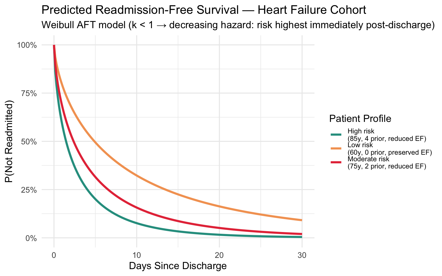
Hazard of Readmission Over 30 Days
# Illustrate the decreasing hazard for an average patient
avg_log_mu <- coef(aft_fit)[1] +
              coef(aft_fit)["age"]          * 72 +
              coef(aft_fit)["prior_admits"] * 1.5 +
              coef(aft_fit)["ef_reduced"]   * 0.55
avg_scale  <- exp(avg_log_mu)

haz_df <- data.frame(
  t      = t_days[-1],
  hazard = dweibull(t_days[-1], shape = k_aft, scale = avg_scale) /
           pweibull(t_days[-1], shape = k_aft, scale = avg_scale, lower.tail = FALSE)
)

ggplot(haz_df, aes(x = t, y = hazard)) +
  geom_line(color = "#E63946", linewidth = 1.3) +
  labs(
    title    = "Hazard of Readmission Over Time — Average Heart Failure Patient",
    subtitle  = "k < 1 confirms decreasing hazard: highest risk in first 1–3 days post-discharge",
    x        = "Days Since Discharge",
    y        = "Hazard h(t)"
  ) +
  theme_minimal(base_size = 13)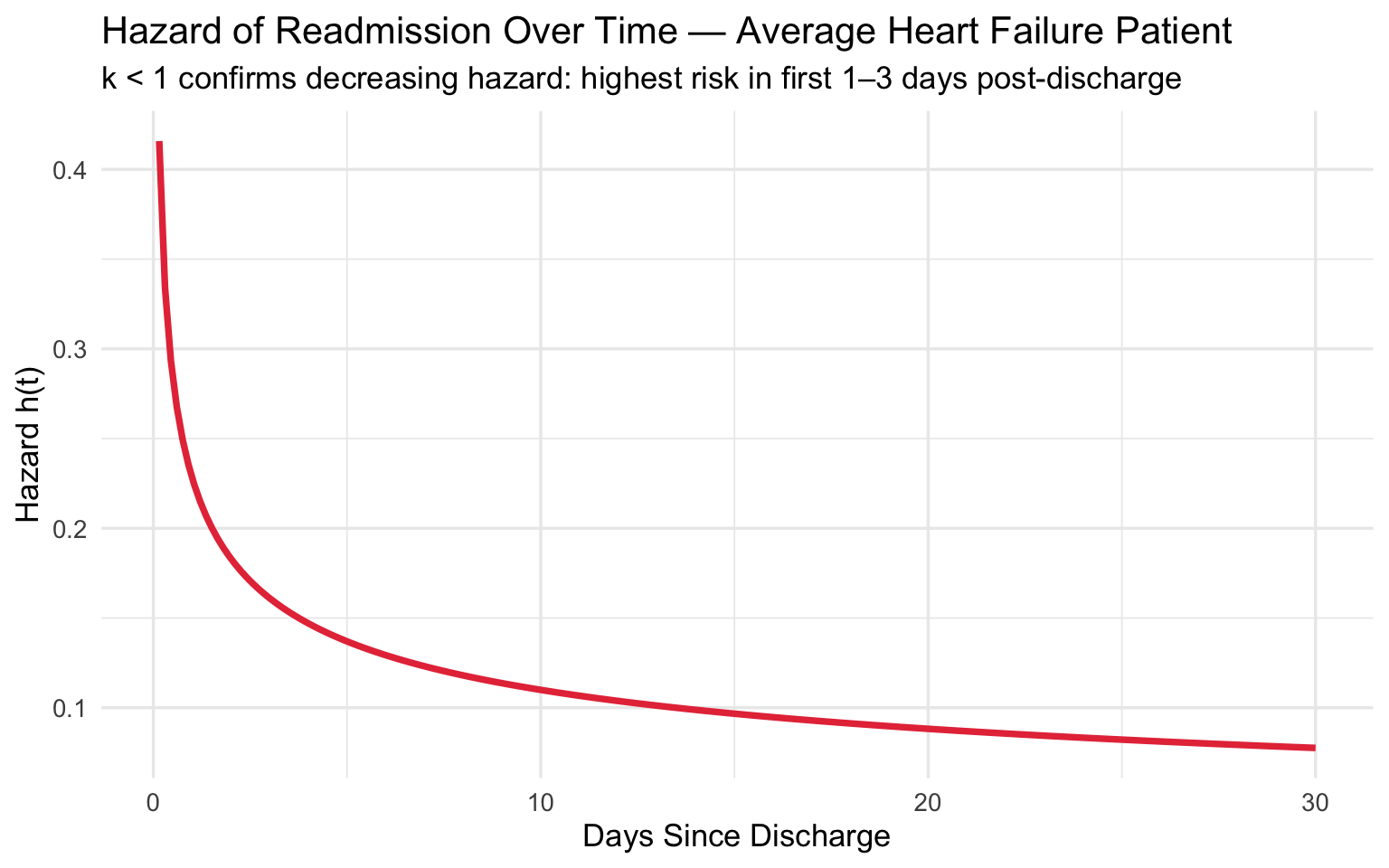
Clinical takeaway: The shape \(k < 1\) confirms that readmission risk is highest immediately after discharge and falls rapidly — reinforcing the value of intensive 48–72 hour post-discharge follow-up calls and rapid outpatient visits for high-risk patients.
Example 3: Implantable Medical Device Reliability — ICD Battery Life
Background
Implantable cardioverter-defibrillators (ICDs) must be replaced when the battery depletes. The timing of replacements follows a Weibull distribution with \(k > 1\) — depletion risk increases with device age. Manufacturers and clinicians use Weibull analysis to:
- Predict the distribution of replacement surgeries across a device cohort
- Estimate B10 life (age at which 10% of devices have depleted)
- Plan elective replacement interval (ERI) alerts
Simulate Device Cohort
set.seed(77)
n_devices <- 400

# ICD battery life in years; k > 1 (wear-out failure pattern)
true_k   <- 4.5    # steep wear-out
true_lam <- 7.2    # characteristic life ~7.2 years

battery_life <- rweibull(n_devices, shape = true_k, scale = true_lam)

# Administrative censoring: study ends at 10 years
status_icd <- as.integer(battery_life <= 10)
time_icd   <- pmin(battery_life, 10)

cat("Devices depleted within 10 years:", sum(status_icd), "/", n_devices, "\n")
## Devices depleted within 10 years: 390 / 400cat("Mean observed follow-up: ", round(mean(time_icd), 2), "years\n")## Mean observed follow-up: 6.64 yearsFit Weibull Model
fit_icd <- fitdistr(battery_life, "weibull")   # use uncensored for simplicity
k_icd   <- fit_icd$estimate["shape"]
lam_icd <- fit_icd$estimate["scale"]

cat("Estimated shape k:  ", round(k_icd, 3), "\n")
## Estimated shape k: 4.439cat("Estimated scale λ: ", round(lam_icd, 3), "years\n\n")## Estimated scale λ: 7.283 years# Key reliability metrics
b10 <- qweibull(0.10, shape = k_icd, scale = lam_icd)
b50 <- qweibull(0.50, shape = k_icd, scale = lam_icd)
mttf <- lam_icd * gamma(1 + 1 / k_icd)
cat(sprintf("B10 life (10%% depleted): %.2f years\n", b10))## B10 life (10% depleted): 4.39 yearscat(sprintf("B50 life (median): %.2f years\n", b50))## B50 life (median): 6.71 yearscat(sprintf("MTTF (mean battery life): %.2f years\n", mttf))## MTTF (mean battery life): 6.64 yearsBattery Reliability Curve with Key Milestones
t_icd <- seq(0, 12, length.out = 400)
S_icd <- pweibull(t_icd, shape = k_icd, scale = lam_icd, lower.tail = FALSE)
F_icd <- 1 - S_icd

rel_df <- data.frame(t = t_icd, S = S_icd, F = F_icd)

ggplot(rel_df, aes(x = t)) +
  geom_line(aes(y = S), color = "#2A9D8F", linewidth = 1.3) +
  geom_line(aes(y = F), color = "#E63946", linewidth = 1.3, linetype = "dashed") +
  # B10 annotation
  geom_vline(xintercept = b10, linetype = "dotted", color = "#E76F51") +
  geom_hline(yintercept = 0.90, linetype = "dotted", color = "#E76F51") +
  annotate("text", x = b10 + 0.1, y = 0.60,
           label = paste0("B10 = ", round(b10, 1), " yrs\n(10% depleted)"),
           hjust = 0, size = 3.5, color = "#E76F51") +
  # B50 annotation
  geom_vline(xintercept = b50, linetype = "dotted", color = "#264653") +
  annotate("text", x = b50 + 0.1, y = 0.25,
           label = paste0("Median = ", round(b50, 1), " yrs"),
           hjust = 0, size = 3.5, color = "#264653") +
  scale_y_continuous(labels = percent, limits = c(0, 1)) +
  scale_x_continuous(breaks = 0:12) +
  labs(
    title    = "ICD Battery Reliability and Failure Curves",
    subtitle = "Green = Reliability S(t)  |  Red dashed = Cumulative failures F(t)",
    x        = "Device Age (years)",
    y        = "Probability"
  ) +
  theme_minimal(base_size = 13)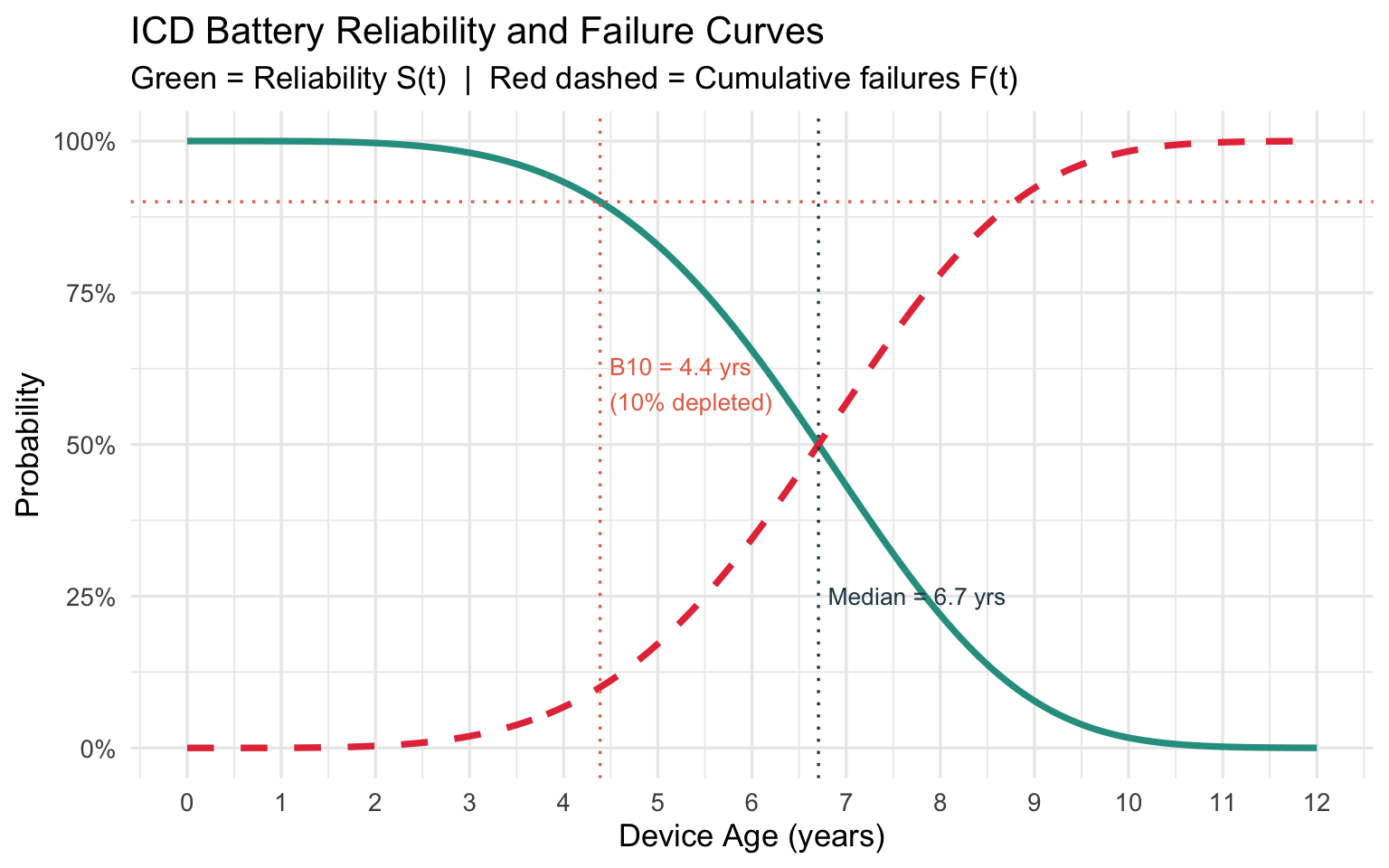
Distribution of Replacement Surgeries Over Time
# Density = expected replacements per unit time across the cohort
pdf_df <- data.frame(
  t   = t_icd,
  pdf = n_devices * dweibull(t_icd, shape = k_icd, scale = lam_icd)
)

ggplot(pdf_df, aes(x = t, y = pdf)) +
  geom_area(fill = "#4E9AF1", alpha = 0.3) +
  geom_line(color = "#4E9AF1", linewidth = 1.3) +
  geom_vline(xintercept = b10,  linetype = "dashed", color = "#E76F51") +
  geom_vline(xintercept = mttf, linetype = "dashed", color = "#264653") +
  annotate("text", x = b10  - 0.1, y = 55, label = paste0("B10\n", round(b10, 1), "y"),
           hjust = 1, size = 3.5, color = "#E76F51") +
  annotate("text", x = mttf + 0.1, y = 55, label = paste0("MTTF\n", round(mttf, 1), "y"),
           hjust = 0, size = 3.5, color = "#264653") +
  labs(
    title    = "Projected ICD Replacement Surgery Load Over Time",
    subtitle = paste0("Cohort of ", n_devices, " devices | k = ", round(k_icd, 2),
                      " confirms wear-out failure (k > 1)"),
    x        = "Device Age (years)",
    y        = "Expected Replacements per Year"
  ) +
  theme_minimal(base_size = 13)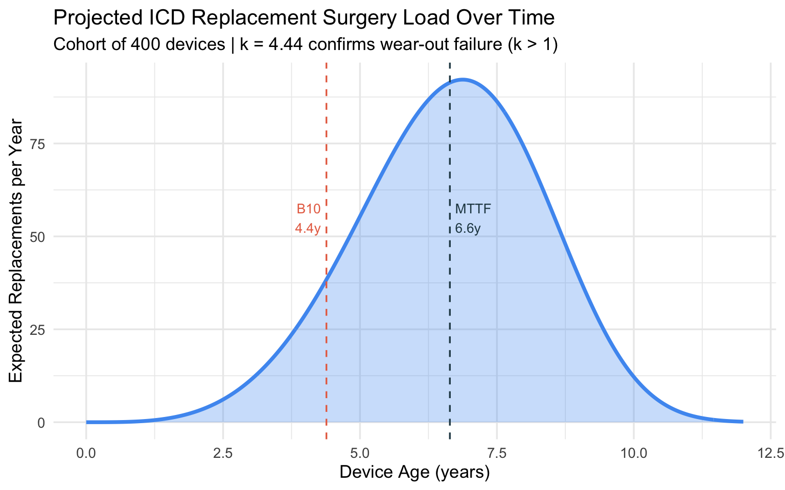
Hazard of Battery Depletion
haz_icd <- data.frame(
  t      = t_icd[-1],
  hazard = dweibull(t_icd[-1], shape = k_icd, scale = lam_icd) /
           pweibull(t_icd[-1], shape = k_icd, scale = lam_icd, lower.tail = FALSE)
)

ggplot(haz_icd, aes(x = t, y = hazard)) +
  geom_line(color = "#E63946", linewidth = 1.3) +
  labs(
    title    = "Hazard of ICD Battery Depletion Over Time",
    subtitle = "Steeply increasing hazard (k > 1) — typical wear-out failure pattern",
    x        = "Device Age (years)",
    y        = "Hazard h(t)"
  ) +
  theme_minimal(base_size = 13)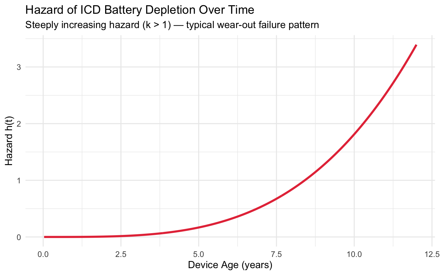
Clinical takeaway: With B10 life at 4.4 years, elective replacement interval (ERI) alerts should activate before this threshold. The steeply rising hazard (\(k \approx 4.5\)) means that once batteries start depleting in a cohort, the surgical workload accumulates rapidly — informing how many electrophysiology slots to reserve.
Comparison Across Examples
comparison <- data.frame(
  Example        = c("NSCLC Survival", "HF Readmission", "ICD Battery"),
  `Shape k`      = c("~1.6", "~0.7", "~4.5"),
  `Hazard shape` = c("Increasing", "Decreasing", "Steeply increasing"),
  `Clinical meaning` = c(
    "Death risk grows as disease progresses",
    "Readmission risk highest right after discharge",
    "Depletion risk rises sharply with device age"
  ),
  `Key output`   = c("Median OS, HTA extrapolation", "B10 = 10% readmitted by day X", "B10 life, MTTF, surgical load")
)

knitr::kable(comparison, col.names = c("Example", "Shape k", "Hazard", "Clinical Meaning", "Key Output"),
caption = "Summary of Weibull Applications in Clinical Medicine")| Example | Shape k | Hazard | Clinical Meaning | Key Output |
|---|---|---|---|---|
| NSCLC Survival | ~1.6 | Increasing | Death risk grows as disease progresses | Median OS, HTA extrapolation |
| HF Readmission | ~0.7 | Decreasing | Readmission risk highest right after discharge | B10 = 10% readmitted by day X |
| ICD Battery | ~4.5 | Steeply increasing | Depletion risk rises sharply with device age | B10 life, MTTF, surgical load |
Session Info
sessionInfo()## R version 4.5.3 (2026-03-11)
## Platform: aarch64-apple-darwin20
## Running under: macOS Tahoe 26.4.1
##
## Matrix products: default
## BLAS: /Library/Frameworks/R.framework/Versions/4.5-arm64/Resources/lib/libRblas.0.dylib
## LAPACK: /Library/Frameworks/R.framework/Versions/4.5-arm64/Resources/lib/libRlapack.dylib; LAPACK version 3.12.1
##
## locale:
## [1] en_US.UTF-8/en_US.UTF-8/en_US.UTF-8/C/en_US.UTF-8/en_US.UTF-8
##
## time zone: America/Phoenix
## tzcode source: internal
##
## attached base packages:
## [1] stats graphics grDevices utils datasets methods base
##
## other attached packages:
## [1] scales_1.4.0 MASS_7.3-65 survival_3.8-6 tidyr_1.3.2 dplyr_1.2.1
## [6] ggplot2_4.0.2
##
## loaded via a namespace (and not attached):
## [1] Matrix_1.7-4 gtable_0.3.6 jsonlite_2.0.0 compiler_4.5.3
## [5] tidyselect_1.2.1 jquerylib_0.1.4 splines_4.5.3 yaml_2.3.12
## [9] fastmap_1.2.0 lattice_0.22-9 R6_2.6.1 labeling_0.4.3
## [13] generics_0.1.4 knitr_1.51 tibble_3.3.1 bslib_0.10.0
## [17] pillar_1.11.1 RColorBrewer_1.1-3 rlang_1.1.7 cachem_1.1.0
## [21] xfun_0.56 sass_0.4.10 S7_0.2.1 cli_3.6.5
## [25] withr_3.0.2 magrittr_2.0.4 digest_0.6.39 grid_4.5.3
## [29] rstudioapi_0.18.0 lifecycle_1.0.5 vctrs_0.7.1 evaluate_1.0.5
## [33] glue_1.8.0 farver_2.1.2 rmarkdown_2.30 purrr_1.2.1
## [37] tools_4.5.3 pkgconfig_2.0.3 htmltools_0.5.9