
The Bootstrap
Contents
- The Idea
- Example 1 — Median ICU Length of Stay
- Example 2 — AUC of a Diagnostic Test
- Example 3 — Number Needed to Treat
1. The Idea
Draw \(B\) random samples with replacement from your data. Compute the statistic on each. The distribution of \(B\) results approximates the sampling distribution — no formula required.
x  <- c(3, 5, 7, 5, 9, 12, 22, 15, 18, 31)          # days (n = 10)
bs <- replicate(10000, median(sample(x, replace = TRUE)))
quantile(bs, c(0.025, 0.975))                          # 95% percentile CI
## 2.5% 97.5%
## 5.0 18.5Bootstrap shines when:
- The statistic has no closed-form SE — median, AUC, NNT, ICC …
- The sample is small or the distribution is skewed
- You want to avoid distributional assumptions
Two CI types used in the examples:
| Type | How | When |
|---|---|---|
| Percentile | \([\hat\theta^*_{(2.5\%)},\;\hat\theta^*_{(97.5\%)}]\) | Large \(n\), symmetric distribution |
| BCa | Bias-corrected and accelerated | Default choice; better small-sample coverage |
2. Example 1 — Median ICU Length of Stay
ICU length of stay is right-skewed; the median is more clinically meaningful than the mean. With \(n = 32\), the analytical CI for the median is awkward — bootstrap is the natural tool.
set.seed(2024)
n   <- 32
los <- sort(round(rexp(n, rate = 1 / 6.5) + 0.5))
cat("Median:", median(los), "d  |  Mean:", round(mean(los), 1), "d\n")
## Median: 5 d | Mean: 8.4 dobs_med <- median(los)
obs_mean <- mean(los)
ggplot(data.frame(los = los), aes(x = los)) +
geom_histogram(binwidth = 3, fill = "#2470b3", color = "white", alpha = 0.8) +
geom_vline(xintercept = obs_med, color = "#902000", linewidth = 1.1) +
geom_vline(xintercept = obs_mean, color = "gray30", linewidth = 1.1,
linetype = "dashed") +
annotate("text", x = obs_med + 0.5, y = Inf, vjust = 2.0, hjust = 0,
color = "#902000", size = 3.5,
label = paste0("Median: ", obs_med, " d")) +
annotate("text", x = obs_mean + 0.5, y = Inf, vjust = 3.8, hjust = 0,
color = "gray30", size = 3.5,
label = paste0("Mean: ", round(obs_mean, 1), " d")) +
labs(title = "ICU Length of Stay — 32 patients",
x = "Length of stay (days)", y = "Count") +
theme_gray()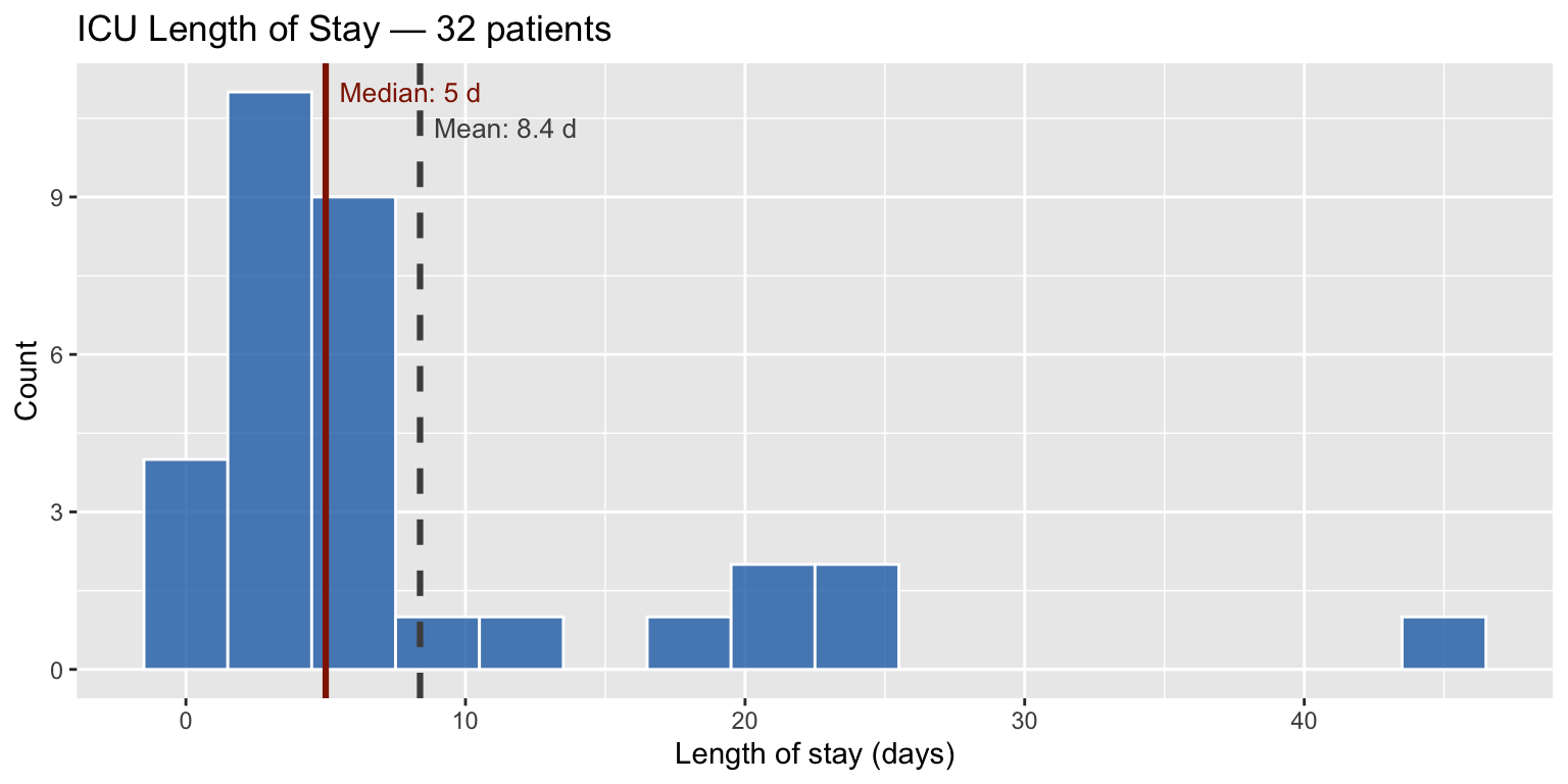
The bootstrap in action
Nine independent resamples of \(n = 32\) drawn with replacement. The red line is each resample’s median; the grey dashed line marks the observed median. Notice how the median moves around — that spread is exactly what the CI captures.
set.seed(2024)
grid_df <- bind_rows(lapply(1:9, function(b) {
  samp <- sample(los, replace = TRUE)
  data.frame(
    panel  = paste0("Resample ", b),
    value  = samp,
    bs_med = median(samp)
  )
}))

ggplot(grid_df, aes(x = value)) +
  geom_histogram(binwidth = 3, fill = "#2470b3", color = "white", alpha = 0.75) +
  geom_vline(aes(xintercept = bs_med), color = "#902000", linewidth = 1) +
  geom_vline(xintercept = obs_med, color = "gray40", linewidth = 0.7,
             linetype = "dashed") +
  facet_wrap(~ panel, ncol = 3) +
  scale_x_continuous(limits = c(0, max(los) + 4)) +
  labs(
    title    = "Nine bootstrap resamples",
    subtitle = "Red = bootstrap median  |  grey dashed = observed median",
    x = "ICU LOS (days)", y = "Count"
  ) +
  theme_gray()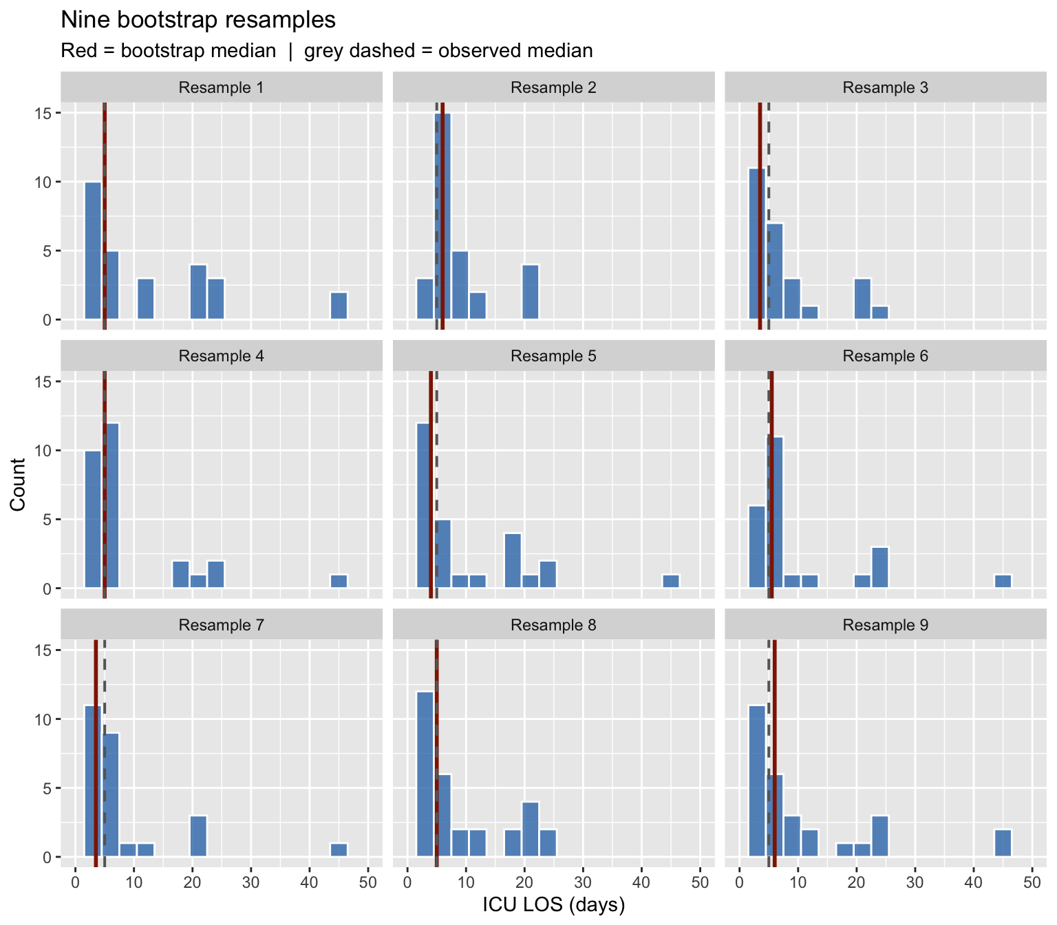
boot analysis
The boot() function requires a statistic that takes
(data, indices). boot.ci() then computes CIs
from the bootstrap replicates.
med_fn <- function(x, i) median(x[i])
b1     <- boot(los, med_fn, R = 2000)
ci1    <- boot.ci(b1, type = c("perc", "bca"))

data.frame(
  Method = c("Observed median", "Percentile 95% CI", "BCa 95% CI"),
  Result = c(
    paste(b1$t0, "days"),
    paste0(round(ci1$percent[4], 1), "–", round(ci1$percent[5], 1), " days"),
    paste0(round(ci1$bca[4],     1), "–", round(ci1$bca[5],     1), " days")
  )
)
## Method Result
## 1 Observed median 5 days
## 2 Percentile 95% CI 3–6 days
## 3 BCa 95% CI 3–6 daysboot_df1 <- data.frame(med = b1$t[, 1])
ggplot(boot_df1, aes(x = med)) +
geom_histogram(binwidth = 0.5, fill = "#2470b3", color = "white", alpha = 0.85) +
geom_vline(xintercept = b1$t0, color = "black", linewidth = 1.1) +
geom_vline(xintercept = ci1$bca[4:5], color = "#902000",
linewidth = 0.9, linetype = "dashed") +
annotate("text", x = ci1$bca[4] - 0.2, y = Inf, hjust = 1, vjust = 1.5,
color = "#902000", size = 3.5,
label = paste0(round(ci1$bca[4], 1), " d")) +
annotate("text", x = ci1$bca[5] + 0.2, y = Inf, hjust = 0, vjust = 1.5,
color = "#902000", size = 3.5,
label = paste0(round(ci1$bca[5], 1), " d")) +
labs(
title = "Bootstrap distribution of median LOS (B = 2,000)",
subtitle = paste0("BCa 95% CI: ", round(ci1$bca[4], 1), "–",
round(ci1$bca[5], 1), " days"),
x = "Bootstrap median (days)", y = "Count",
caption = "Dashed red = BCa bounds | black = observed median"
) +
theme_gray()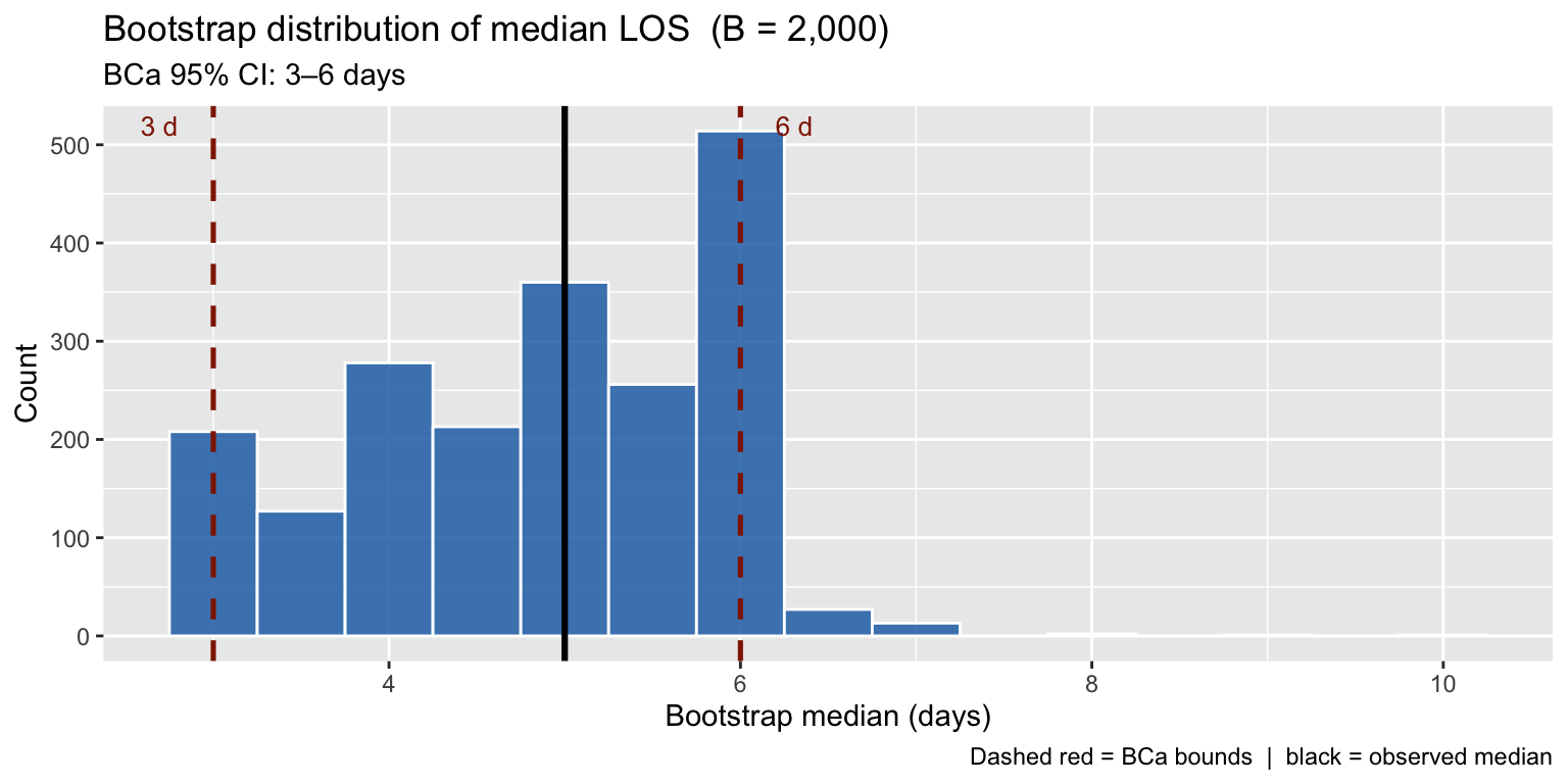
The bootstrap distribution inherits the skew from the underlying data — a key reason BCa is preferred over the simple percentile CI here.
3. Example 2 — AUC of a Diagnostic Test
A troponin assay is evaluated for acute MI detection in \(n = 200\) patients. The AUC equals the probability that a randomly chosen AMI patient has a higher test value than a randomly chosen non-AMI patient — equivalently, the normalised Mann–Whitney \(U\) statistic.
set.seed(2024)
df2 <- data.frame(
  label = c(rep("AMI", 80), rep("No AMI", 120)),
  trop  = c(exp(rnorm(80,  mean = 3.5, sd = 0.8)),
            exp(rnorm(120, mean = 1.6, sd = 0.7)))
)
ggplot(df2, aes(x = log(trop), fill = label, color = label)) +
geom_density(alpha = 0.35, linewidth = 0.9) +
scale_fill_manual( values = c("AMI" = "#902000", "No AMI" = "#2470b3")) +
scale_color_manual(values = c("AMI" = "#902000", "No AMI" = "#2470b3")) +
labs(title = "Troponin distribution by AMI status",
x = "log(Troponin, ng/L)", y = "Density",
fill = NULL, color = NULL) +
theme_gray() +
theme(legend.position = "top")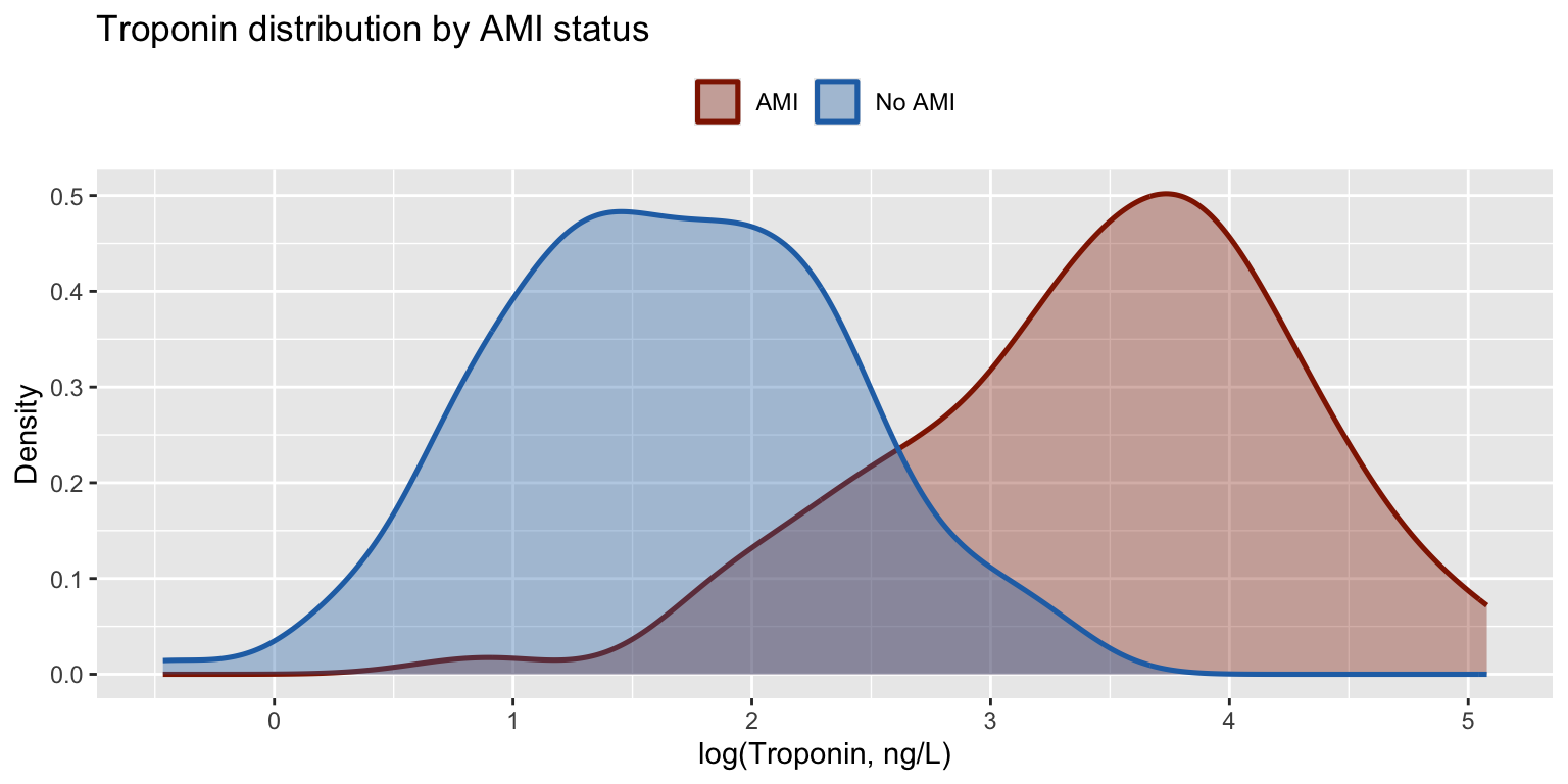
roc_pts <- function(score, is_pos) {
  cuts <- sort(unique(score), decreasing = TRUE)
  tpr  <- sapply(cuts, function(t) mean(score[is_pos]  >= t))
  fpr  <- sapply(cuts, function(t) mean(score[!is_pos] >= t))
  data.frame(fpr = c(0, fpr, 1), tpr = c(0, tpr, 1))
}

is_ami  <- df2$label == "AMI"
roc     <- roc_pts(df2$trop, is_ami)
auc_obs <- with(roc, sum(diff(fpr) * (tpr[-1] + tpr[-length(tpr)]) / 2))

ggplot(roc, aes(x = fpr, y = tpr)) +
  geom_ribbon(aes(ymin = 0, ymax = tpr), fill = "#902000", alpha = 0.08) +
  geom_line(color = "#902000", linewidth = 1.2) +
  geom_abline(slope = 1, intercept = 0, linetype = "dashed", color = "gray55") +
  annotate("text", x = 0.60, y = 0.22, size = 4.5, color = "#902000",
           label = paste0("AUC = ", round(auc_obs, 3))) +
  labs(title = "ROC Curve — Troponin for AMI  (n = 200)",
       x = "1 − Specificity  (FPR)", y = "Sensitivity  (TPR)") +
  theme_gray()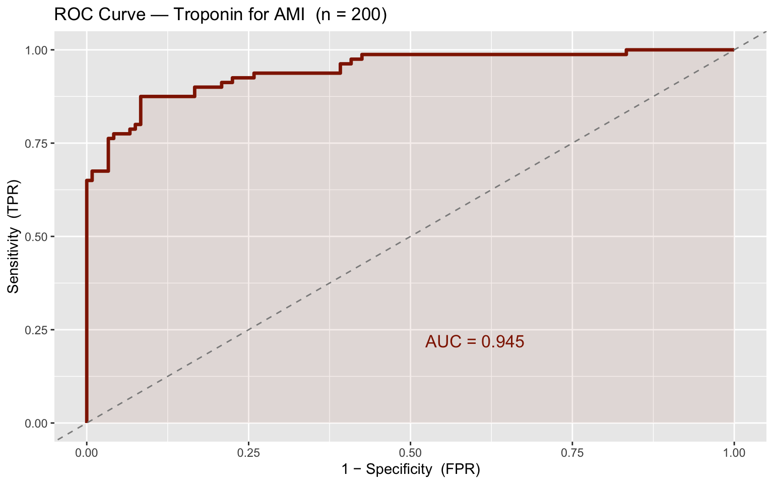
# AUC = Mann–Whitney U / (n_pos × n_neg); identical to trapezoidal ROC AUC
auc_fn <- function(data, i) {
  d   <- data[i, ]
  pos <- d$trop[d$label == "AMI"]
  neg <- d$trop[d$label == "No AMI"]
  if (length(pos) == 0 || length(neg) == 0) return(NA_real_)
  wilcox.test(pos, neg, exact = FALSE)$statistic / (length(pos) * length(neg))
}

b2  <- boot(df2, auc_fn, R = 2000)
ci2 <- boot.ci(b2, type = c("perc", "bca"))

data.frame(
  Method = c("Observed AUC", "Percentile 95% CI", "BCa 95% CI"),
  Result = c(
    round(b2$t0, 3),
    paste0(round(ci2$percent[4], 3), "–", round(ci2$percent[5], 3)),
    paste0(round(ci2$bca[4],     3), "–", round(ci2$bca[5],     3))
  )
)
## Method Result
## 1 Observed AUC 0.945
## 2 Percentile 95% CI 0.91–0.973
## 3 BCa 95% CI 0.899–0.969boot_df2 <- data.frame(auc = b2$t[, 1])
ggplot(boot_df2, aes(x = auc)) +
geom_histogram(bins = 50, fill = "#902000", color = "white", alpha = 0.85) +
geom_vline(xintercept = b2$t0, color = "black", linewidth = 1.1) +
geom_vline(xintercept = ci2$bca[4:5], color = "#2470b3",
linewidth = 0.9, linetype = "dashed") +
annotate("text", x = ci2$bca[4] - 0.001, y = Inf, hjust = 1, vjust = 1.5,
color = "#2470b3", size = 3.5,
label = round(ci2$bca[4], 3)) +
annotate("text", x = ci2$bca[5] + 0.001, y = Inf, hjust = 0, vjust = 1.5,
color = "#2470b3", size = 3.5,
label = round(ci2$bca[5], 3)) +
labs(
title = "Bootstrap distribution of AUC (B = 2,000)",
subtitle = paste0("BCa 95% CI: ", round(ci2$bca[4], 3), "–",
round(ci2$bca[5], 3)),
x = "Bootstrap AUC", y = "Count",
caption = "Dashed blue = BCa bounds | black = observed AUC"
) +
theme_gray()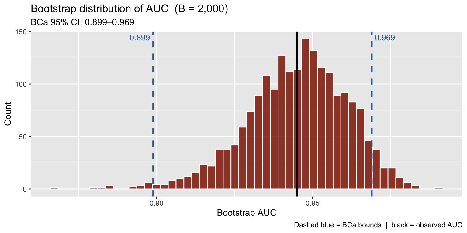
Tip. The
pROCpackage computes AUC with DeLong CIs (semi-parametric, fast) and supports paired comparisons of two AUCs. UsepROC::ci.auc()as a quick check against the bootstrap.
4. Example 3 — Number Needed to Treat
\[\text{NNT} = \frac{1}{\hat{p}_{\text{ctrl}} - \hat{p}_{\text{trt}}}\]
There is no simple closed-form CI for the NNT. Bootstrap is the standard approach.
A simulated RCT: 200 patients per arm, binary outcome (30-day hospital readmission).
set.seed(2024)
n_arm <- 200

df3 <- data.frame(
  arm   = rep(c("Control", "Treatment"), each = n_arm),
  event = c(rbinom(n_arm, 1, 0.30),
            rbinom(n_arm, 1, 0.19))
)

rates3 <- df3 |>
  group_by(arm) |>
  summarise(n = n(), events = sum(event), rate = mean(event), .groups = "drop") |>
  rowwise() |>
  mutate(
    lower = binom.test(events, n)$conf.int[[1]],
    upper = binom.test(events, n)$conf.int[[2]]
  ) |>
  ungroup()
ggplot(rates3, aes(x = arm, y = rate * 100, fill = arm)) +
geom_col(width = 0.45, alpha = 0.85) +
geom_errorbar(aes(ymin = lower * 100, ymax = upper * 100),
width = 0.12, linewidth = 0.85) +
scale_fill_manual(values = c("Control" = "#902000", "Treatment" = "#2470b3")) +
scale_y_continuous(limits = c(0, 45)) +
labs(title = "30-day readmission rates (n = 200 per arm)",
x = NULL, y = "Readmission rate (%)",
caption = "Error bars: exact (Clopper–Pearson) 95% CI") +
theme_gray() +
theme(legend.position = "none")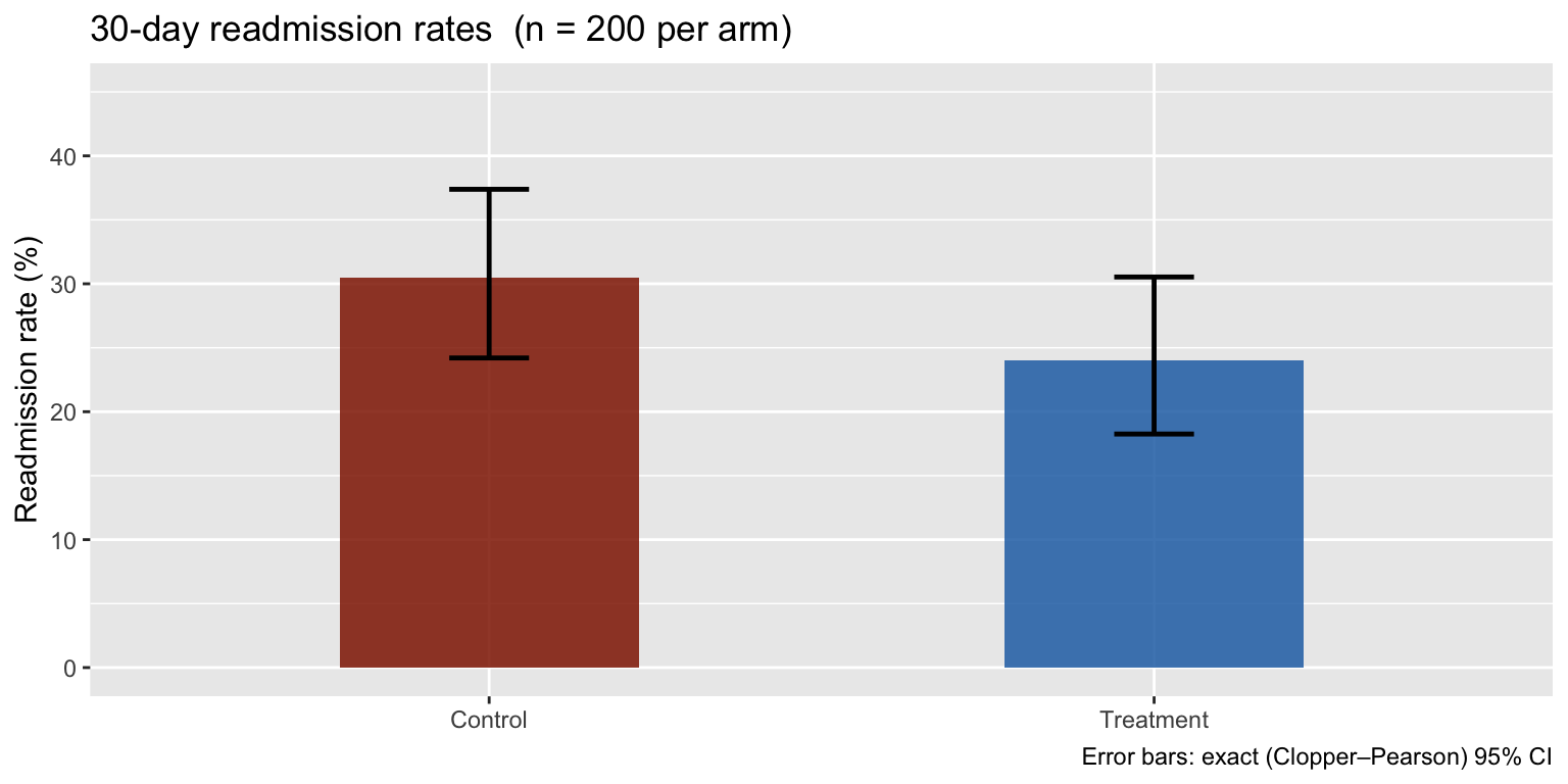
nnt_fn <- function(data, i) {
  d   <- data[i, ]
  r_c <- mean(d$event[d$arm == "Control"])
  r_t <- mean(d$event[d$arm == "Treatment"])
  1 / (r_c - r_t)
}

b3  <- boot(df3, nnt_fn, R = 2000)
ci3 <- boot.ci(b3, type = c("perc", "bca"))

data.frame(
  Method = c("Observed NNT", "Percentile 95% CI", "BCa 95% CI"),
  Result = c(
    round(b3$t0, 1),
    paste0(round(ci3$percent[4], 1), "–", round(ci3$percent[5], 1)),
    paste0(round(ci3$bca[4],     1), "–", round(ci3$bca[5],     1))
  )
)
## Method Result
## 1 Observed NNT 15.4
## 2 Percentile 95% CI -94–124.7
## 3 BCa 95% CI -36.7–262.8boot_df3 <- data.frame(nnt = b3$t[, 1])
ggplot(boot_df3, aes(x = nnt)) +
geom_histogram(bins = 50, fill = "#2470b3", color = "white", alpha = 0.85) +
geom_vline(xintercept = b3$t0, color = "black", linewidth = 1.1) +
geom_vline(xintercept = ci3$bca[4:5], color = "#902000",
linewidth = 0.9, linetype = "dashed") +
annotate("text", x = ci3$bca[4] - 0.2, y = Inf, hjust = 1, vjust = 1.5,
color = "#902000", size = 3.5,
label = round(ci3$bca[4], 1)) +
annotate("text", x = ci3$bca[5] + 0.2, y = Inf, hjust = 0, vjust = 1.5,
color = "#902000", size = 3.5,
label = round(ci3$bca[5], 1)) +
labs(
title = "Bootstrap distribution of NNT (B = 2,000)",
subtitle = paste0("BCa 95% CI: ", round(ci3$bca[4], 1), "–",
round(ci3$bca[5], 1)),
x = "NNT", y = "Count",
caption = "Dashed red = BCa bounds | black = observed NNT"
) +
theme_gray()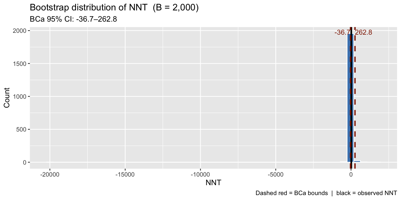
The NNT bootstrap distribution is right-skewed — further evidence that symmetric analytical CIs would give poor coverage here.
What NNT means visually
nnt_est <- round(b3$t0)

icon_df <- data.frame(
  id    = seq_len(nnt_est),
  x     = (seq_len(nnt_est) - 1L) %% 10L + 1L,
  y     = -((seq_len(nnt_est) - 1L) %/% 10L),
  group = ifelse(seq_len(nnt_est) == 1L, "Readmission\nprevented", "No benefit")
)

ggplot(icon_df, aes(x = x, y = y, color = group)) +
  geom_point(size = 9, alpha = 0.9) +
  scale_color_manual(values = c("Readmission\nprevented" = "#2470b3",
                                "No benefit"             = "gray75")) +
  labs(
    title = paste0("NNT = ", nnt_est,
                   ":  treat ", nnt_est,
                   " patients to prevent 1 readmission"),
    color = NULL, x = NULL, y = NULL
  ) +
  theme_gray() +
  theme(
    axis.text  = element_blank(),
    axis.ticks = element_blank(),
    panel.grid = element_blank(),
    legend.position = "right"
)![]()
Other packages.
rsample(tidymodels) provides a tidy interface to bootstrap resampling withbootstraps().inferwraps it in a declarative pipeline suitable for teaching. Both call the same resampling logic under the hood —bootremains the reference implementation for anything that needs BCa intervals or stratified resampling.